
Most interfaces look like they were drawn with a ruler. That is usually what you want, but a landing page, an onboarding hint or a call-to-action button sometimes needs to feel like a person made it. A quick circle around a button, a handwritten "start here" with an arrow pointing at it: the kind of mark you would make on a printed page.
We wanted that on Aznabee, so we built it, and then released it as an open-source library: freehand-ui. It wraps any existing web element with a hand-drawn doodle layer, and you can use it in your own project today.
- npm: @aznabee/freehand-ui
- GitHub: Lakshay-art/freehand-ui
What freehand-ui does
freehand-ui adds a thin SVG overlay on top of an element: pen strokes, handwritten notes, arrows and small decorations. It does not change your HTML layout and it never blocks clicks (the overlay uses pointer-events: none), so you can add it to a button or a card without rewriting anything.
| Feature | What it gives you |
|---|---|
| Border | A hand-drawn frame that follows the element's shape and border-radius |
| Notes | Handwritten text beside the element, set in the Caveat font |
| Arrows | Curved, straight, dotted or looped pointers that draw themselves in |
| Decorations | Corner accents, stars, hearts and more |
| Localised | Notes in the visitor's own language, right-to-left included |
| Responsive | Stays aligned on resize, scroll and reflow |
It is a good fit for call-to-action buttons, feature cards, onboarding hints and playful marketing UI.
Where we use it on Aznabee
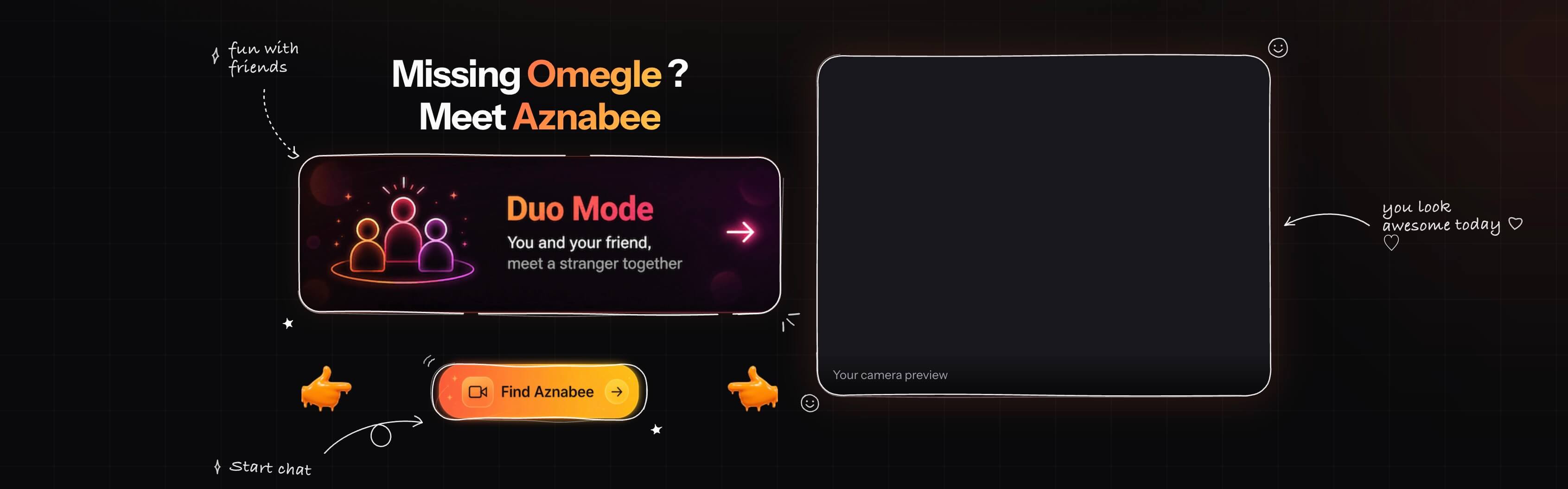
The landing page you see when you open Aznabee is the real thing. The frame around the Duo Mode card, the "fun with friends" note with its dotted arrow, the outline around the Find Aznabee button and the "you look awesome today" note beside the camera preview are all drawn by freehand-ui, over ordinary buttons and cards.
That is the point of the library: the underlying components stay normal HTML and React. The doodle is a layer on top, so it costs nothing when you want to change the design underneath.
Quick start
Install it from npm:
npm install @aznabee/freehand-uiIn plain JavaScript, call doodle() on an element or a CSS selector:
import { doodle } from "@aznabee/freehand-ui";

doodle(".card");
That draws a hand-drawn border around the element and keeps it aligned as the page resizes, scrolls or reflows. Calling it twice on the same element replaces the previous overlay, so there are no duplicates.
Notes, arrows and decorations
Add a handwritten note, and an arrow that points from it to the element:
doodle(".cta", {
  note: { text: "start chat", position: "bottom-right", underline: false },
  arrow: { from: "note", to: "edge", style: "curved" },
  decorations: true,
});
Notes can sit on any of eight sides (top, top-right, right, bottom-right, bottom, bottom-left, left, top-left). They are measured from real glyph metrics and laid out so they never sit on top of the element. If a note would run past the edge of the viewport, it slides inward by exactly the amount it overhangs, instead of jumping to the other side.
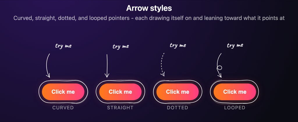
Arrows come in four styles: curved, straight, dotted and looped. They animate by default: the shaft is drawn on as if by a pen travelling from the note to the tip, and the whole arrow then leans a few pixels toward what it points at. Both gestures are pure CSS, and they switch off automatically when the visitor has prefers-reduced-motion: reduce set.
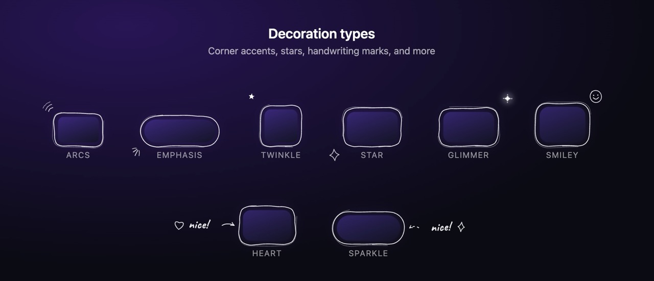
Decorations are deliberately limited. A frame stays readable with at most two marks around it, so the library caps them at two: usually one corner accent and one corner star, plus a small heart or sparkle beside the note. Small components such as chips and icon buttons get a mirrored pair of marks instead of corner marks.
You can also make the border read as a few confident dashes rather than one closed loop, with addBreaks:
doodle(".cta", { addBreaks: true });
doodle(".cta", { addBreaks: { count: 4, min: 6, max: 30 } });
Use it in React and Next.js
The React entry point is a wrapper component. Every option from the JavaScript version works as a prop:
import Doodle from "@aznabee/freehand-ui/react";

<Doodle note="start chat" strokeWidth={2}>
  <Button />
</Doodle>
It ships with "use client", so it drops into the Next.js App Router without an extra wrapper, and it renders on the server without hydration warnings: the overlay is drawn in an effect, after the page has loaded.
Two details make it behave the way you would expect:
- The wrapper hugs its child, so the frame fits a button instead of stretching to the width of its container.
- Border radius is picked up automatically, so a wrapped pill button is drawn as a pill.
If you already hold a ref to an element, skip the wrapper and use the hook:
import { useDoodle } from "@aznabee/freehand-ui/react";

function Card() {
  const ref = useRef(null);
  useDoodle(ref, { note: "new", decorations: true });
  return <div ref={ref}>...</div>;
}
There is also a React Native entry point, @aznabee/freehand-ui/native, which draws the same doodles with react-native-svg.
Notes in the visitor's language
A note can be written once per language. The library draws the one the visitor reads, taken from the browser's language list, with no i18n library:
<Doodle
  note={{
    en: "start chat",
    "pt-BR": "iniciar conversa",
    hi: "चैट शुरू करें",
    ar: "ابدأ الدردشة",
    default: "start chat",
  }}
>
  <Button />
</Doodle>
Matching follows what the visitor asked for, most wanted language first: an exact tag, then a less specific one, then a sibling of the same language, then default. Right-to-left notes need no flag, because the direction is read from the text itself. If your app has its own language state, pass it with the locale prop.
One honest limit: Caveat only covers Latin and Cyrillic. Notes in Devanagari, Arabic or CJK scripts fall back to a system font, so they are legible but not handwritten. Point fontFamily at a face that covers your script to keep the handwriting look.
Design principles
- Framework agnostic. The core is plain JavaScript, and React is an optional entry point.
- SVG based. The marks are hand-drawn paths, not CSS borders.
- Non-invasive.
pointer-events: noneand no layout changes.
- Responsive. It uses
ResizeObserver, scroll listeners andrequestAnimationFrameto stay aligned.
- Lightweight. There are zero runtime dependencies.
Get it
freehand-ui is MIT licensed and open source. Install it from npm, read the full documentation and examples on GitHub, and open an issue if something looks off.
And if you want to see it in a real product, open Aznabee and look at the borders, notes and arrows on the home screen. Every one of them is drawn by this library.